Boldly Going

I recently accepted a challenge to attempt something not often encountered, and learned the reason why: it's quite difficult to do well. That is, gilding an inscription carved in slate with a natural cleft surface. Slate being made up of infinite layers of pressed and petrified sediment, when split the stone yields two naturally undulating planes. The harder the slate the cleaner and calmer the undulation; pick a softer shade like, say, purple, then brave thyself for stormier seas.

Since the client for this house number specifically requested purple slate, I reached for a honed piece that was already nearly the right dimension, grabbed my 3-lb sledge, steadied the wide splitting chisel and hoped for the best. It was the worst. Fortunately I had another piece from a Vermont quarry, a massive beautiful length of purple cleft I was saving for a big inscription. I cut off a jagged end and fabricated it to size, leaving much of the piece intact and still awaiting something big and bold and to-be-blogged-about.

The house number was intended to be set in to a cut-out of the building's brick facade, no mounting hardware required. That meant I could get away with a relatively thin piece of slate, in this case around 3/4" thick. The design called for lining figures, and since the dimension for the stone had already been determined by the contractor responsible for installing the stone (and for getting me the job, thanks, John Carlton!), I made them 2.25" tall to work best with the aspect ratio.

I've taken to rebrushing my designs onto the stone once the layout is transferred, and for a job in cleft slate it makes a huge difference, as often the transfer process only touches the high points of the stone, leaving gaps between flakes in the cleft. It also restores the calligraphic link to the original design. Otherwise I might have to call myself Marsolais Press & Stencilcarving. No thanks!

After carving to within an eyelash of the painted outline, the stone is then washed and given a final pass of the chisel. This actually was the easy part. The thing about gilding is that even in ideal conditions, with a beautifully cut inscription in hard, honed slate, it is an incredibly fussy process. The gold size (a bonding agent, not a dimension) is temperamental and translucent, making it difficult to see over the layer of shellac, also translucent but shiny, applied to the finished inscription to seal the slate. Also the gossamer sheets of 23K gold, only a grain of sand heavier than air itself, like to take magic carpet rides powered by currents of static electricity all over your work station and go everywhere except on the sized landing strips you've prepared for it.

But the main challenge here is that both the shellac and the size had to be applied with surgical precision to the very living edge of the carved figures. And with the jagged fractals inherent in the cleft, a clean outline occasionally had to be painted on.

The first pass, predictably, yielded what are referred to as "holidays", which is where it is supposed your attention, skills or luck went while you were trying to do a good job. The size was then reapplied and once it dried to the right amount of tack, the gold was carefully feathered into the gaps, holiday over, back to work.

It took a few attempts and the judicious application of a scalpel, literally a surgical operation, to remove flecks of gold sunk into the cleft. But I eventually arrived at the finished product. Gilding is a process that normally rewards fussiness, shining a flashlight on one's best work. Here it shined on imperfections with humbling clarity. As with every project made by hand, the organic irregularities left by the mark of the tool and the quality of the materials either accentuate or thwart the idealization of the desired form. Where this falls in the range of acceptable variation depends on your definition of it. I proved to myself that I was equal to but not greater than the challenge. In the end, that's the mixed pleasure of learning things the hard way.  

Groton School

I recently spent a pleasant afternoon visiting the Newport-based lettercarver and artist Brooke Roberts on site at the Groton School in Groton, MA, where he was adding an inscription to the wall commemorating distinguished alumni located in St. John's Chapel. The account goes back to John Howard Benson's stewardship of the John Stevens Shop (c. 1940), and while other shops and sensibilities are represented in the limestone brickwork, for the last 30 years Brooke has been holding the line beautifully against sandblasting and the typographically ill-advised.

I live about a half-hour from Groton and was long overdue for a visit, having first learned of the inscription gallery years ago when I read the Typophiles' Chap Book John Howard Benson: Life and Work. There's a photograph in the book of a job JHB did in the mid-forties that depicts a masterful navigation of architectural joinery, which in lesser hands may have proven disruptive to the layout's flow. Of course JHB nailed it and scrutiny of the result never fails to impress.

On the morning I arrived the school's endowment was undergoing a weight-loss program as construction crews hammered various buildings into shape in time for their fall semester close-up. By comparison Brooke's staging looked like an architect's model, but there was no question that the most demanding renovation on campus was taking place inside St. John's Chapel.

It's a dimly lit sanctuary that does not reward amateur photography, and I was not intrepid enough to take advantage of what little good light the stained glass windows allow. But a photograph can't capture, in a glance, the experience of being present before the dense, whispering volume of inscriptions.

To begin a new memorial, Brooke carefully resurfaces the rough-hewn limestone with an angle grinder and then finishes it with a file. Here I was glad to be of use as I followed the movements of his grinder with a vacuum extension to manage the dust. This process will allow for a clean, legible transfer of the layout and ultimately a sharper delineation of the carved line.

I took a walk around the campus to give Brooke the space to concentrate on transferring the layout and after about an hour slipping through construction sites and wandering around the library I returned to find him ready to begin carving. Limestone is much softer a material than slate and the technique required to carve it effectively is sort of a controlled backing-off from the stone. It offers very little resistance and a sharp tungsten carbide chisel can easily plunge through the carefully established planes. But these were my concerns, not Brooke's. This being his umpteenth rodeo, he dispatched the work with an enviably nonchalant dexterity, and soon a line of carved shapes emerged beyond the swing of his mallet.

It has been a while since I had the opportunity to observe another lettercarver at play, and I'm grateful to Brooke for inviting me up to Groton to see how it's done. Architectural site work is a heightened realm of engagement in the life of a lettercarver and the tranquil atmosphere of St. John's Chapel provided an interesting contrast to some of the stories Brooke told about major, and at times majorly stressful, jobs in DC and elsewhere. Sometimes the planks on the scaffold narrow to a tightrope as passers-by stop to watch and the wealthy donors, accustomed to perfection, wait for the work to be done. Brooke is stepping off the wire and away from the craft by choice to focus on his first love, painting. How fitting that one of his last carving jobs would be here at the Groton School, among his first institutional clients.

It is thrilling to consider that someday it will be me on the scaffold, balancing and swinging and whistling. The memory of this afternoon will keep me grinning until I get there.


Paypah Cuttah

I received a tip yesterday from a reliable source (Thanks, Matt!) for a smallish guillotine paper cutter available on the North Shore advertised on Craigslist. (Thanks, Craig!) After taking in the Vandercook, Colt’s Armory and two double-wide type cabinets last fall, I was quite sure I had maxed out my usable floor space without risk of sealing off some corner of the shop. I’m very fortunate to have a great relationship with a local offset printing company in town who lets me cut paper on its giant thumb-activated hydraulic cutter, so I basically gave up on a search for my own full-size, floor model guillotine. But in this case both the size and the price were right. That combined with a friendly, motivated seller put me on 495 North first thing this morning, aimed for scenic, charming Byfield, Massachusetts.

If you’ve ever asked yourself whether a Challenge 193 HL can fit in the back of a Subaru Forester, I can tell you that it just fits.

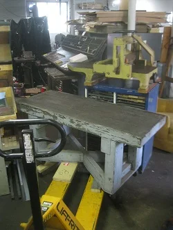
Getting it out was, ahem, a challenge. Being a sole proprietor has a few drawbacks and one of them is not having anyone else around to help you crush yourself under 475 pounds of iron. The recent undertaking of lifting the Vander- cook off its rolling cart and into position (Thanks, Jamie!) gave me enough confidence to attempt the extraction with a pry bar and a mixed-length stack of 2x4s. And it all went relatively smoothly despite the massive weight and the fact that the cutter was wider than the shop door. It took some clever maneuvering, but I made it through on my trusty rolling workbench. So glad I didn’t already remove the wheels in anticipation of using it to support a large piece of slate on its way from Vermont.

It took about two hours, but I eventually got the cutter into position and blocked as high as I felt was safe for a one-man operation. Then I went looking for help. (Thanks, Clayton!) The last inch was a bit of an adventure, but once on the galley cabinet it slid easily into place. Now it looks like it’s been there the whole time. It wants a thorough scrubbing and possibly a new paint job, however the only thing that really matters to me is that it cuts the paper. And you know what: it cuts the paper!

(Thanks, Tim!)